Duke University, Nasher Museum of Art
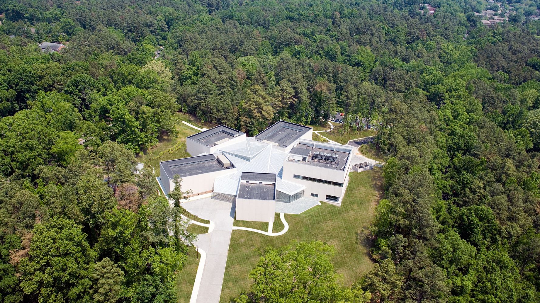
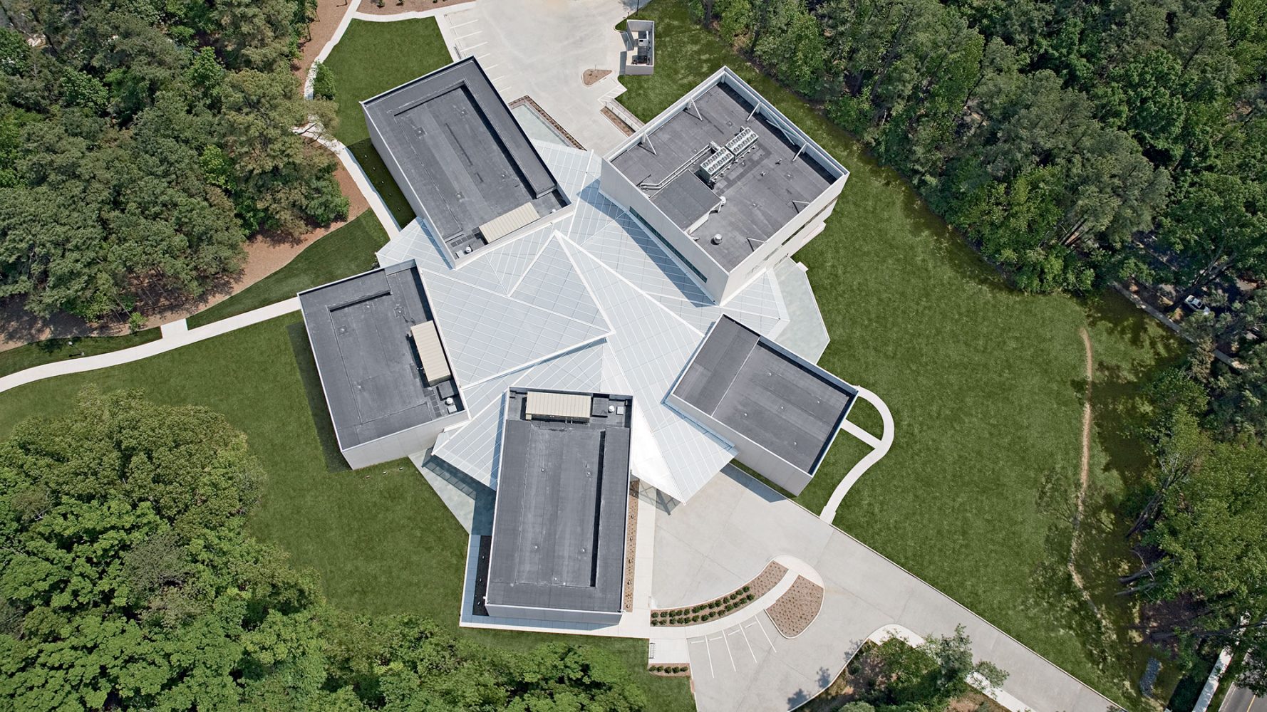
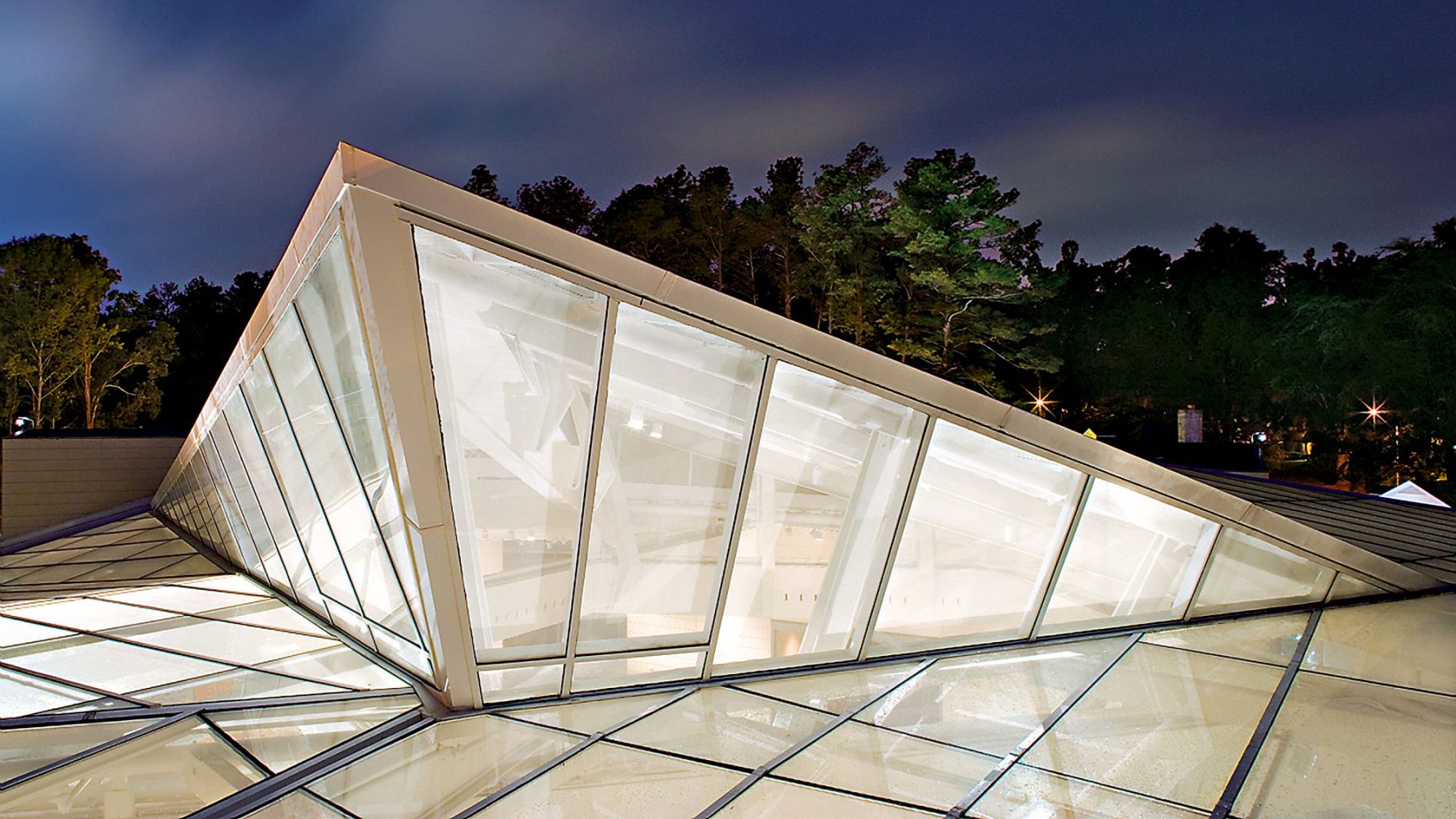
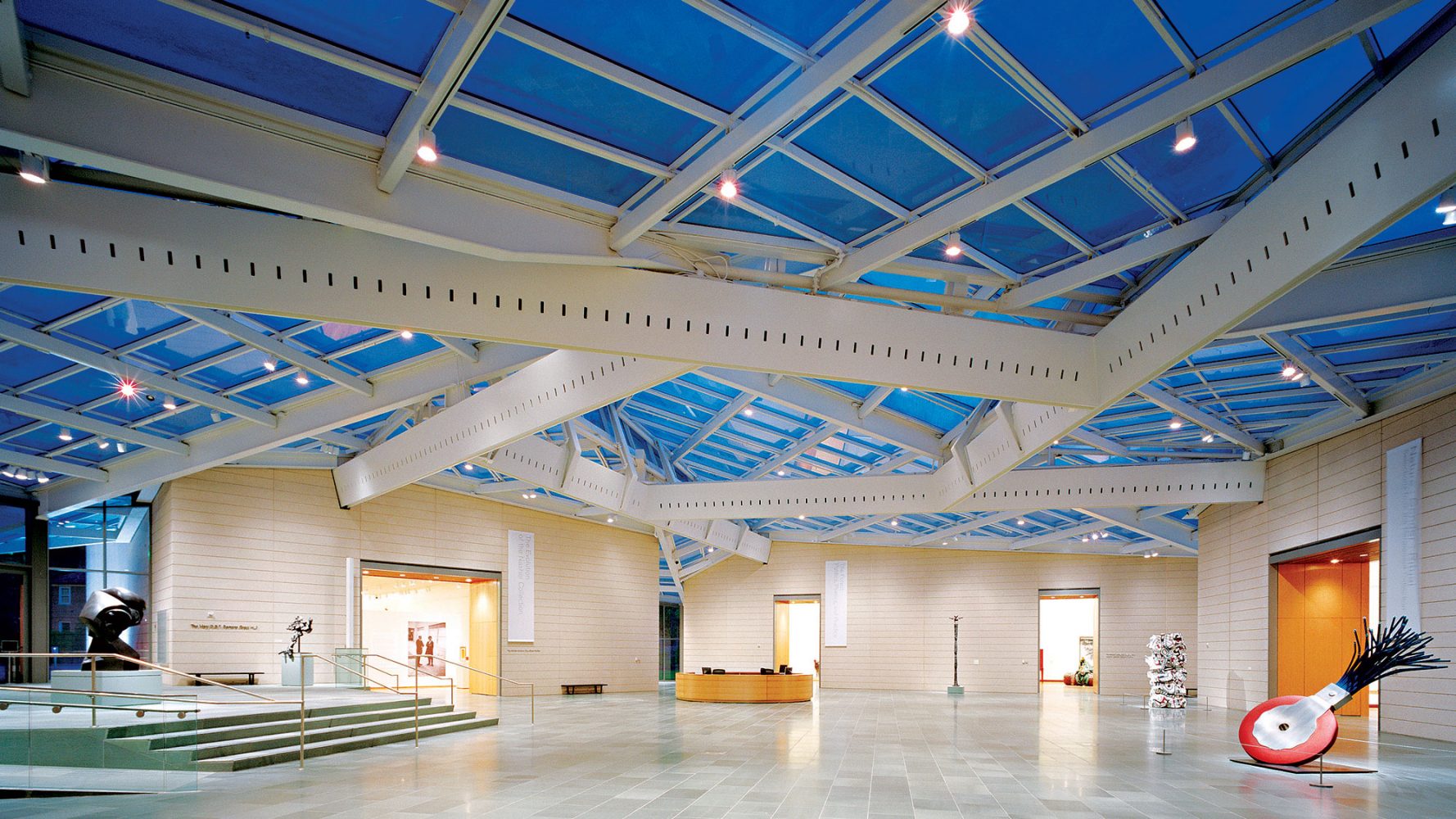
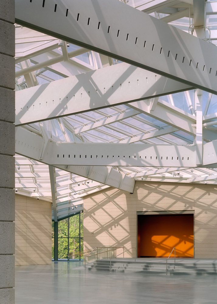
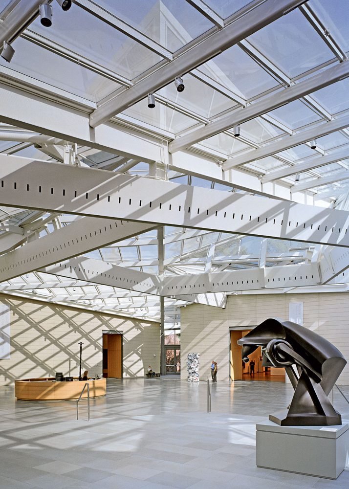
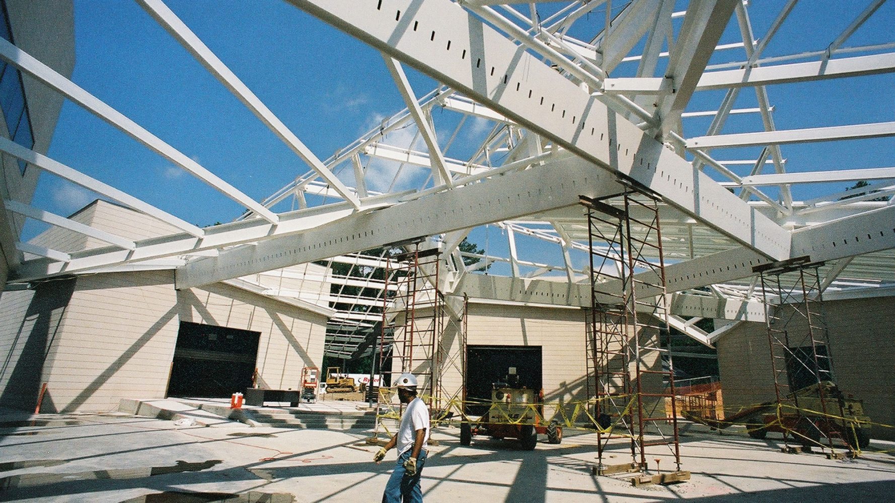
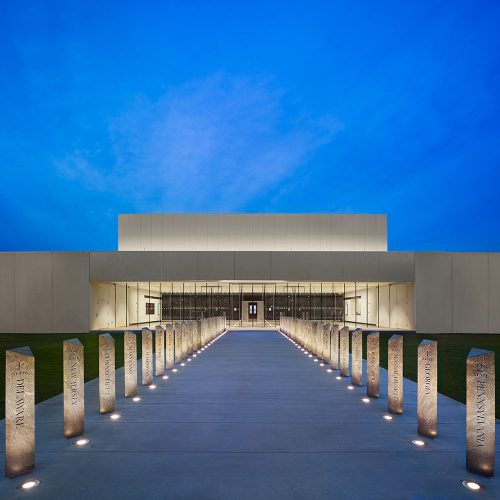
In a forest clearing, five loosely arranged pavilion buildings contain galleries, classrooms, and the Great Hall and define the edges of a glazed central court that serves as the Museum’s entrance, generous sculpture gallery, and nexus of circulation.
The design for the Duke University Museum of Art moved the museum out of its outgrown home in a renovated science building on campus and into an entirely new building fit for the display of art and for art education. Renamed the Nasher Museum of Art after a donation by art patron, philanthropist, and Duke alumnus Raymond D. Nasher, the new museum was designed to create a distinctive campus landmark and a cultural center serving the university and surrounding communities.
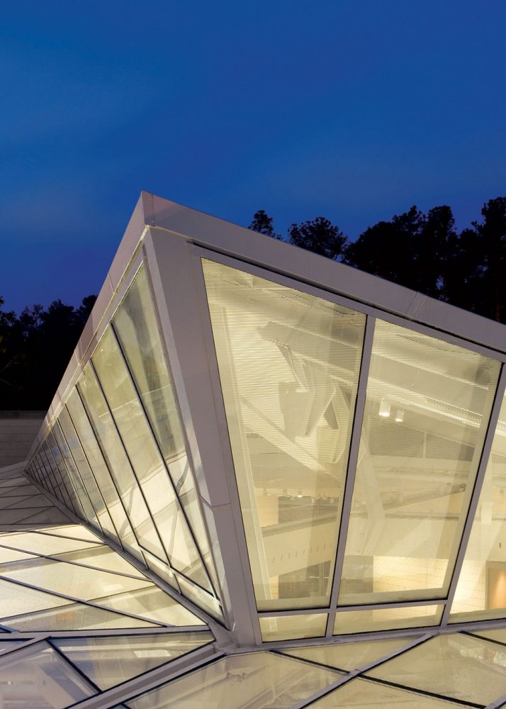
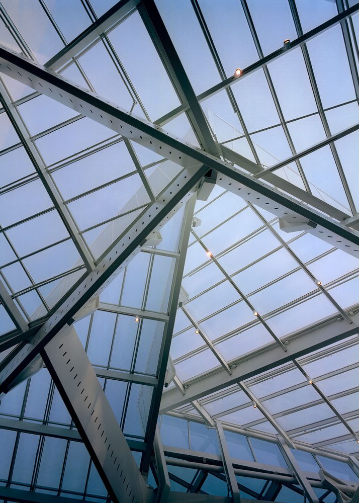
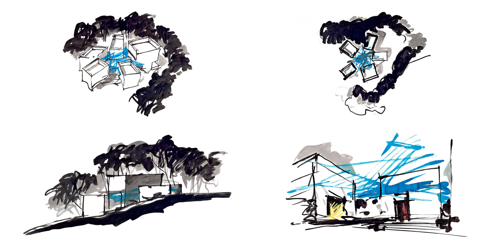
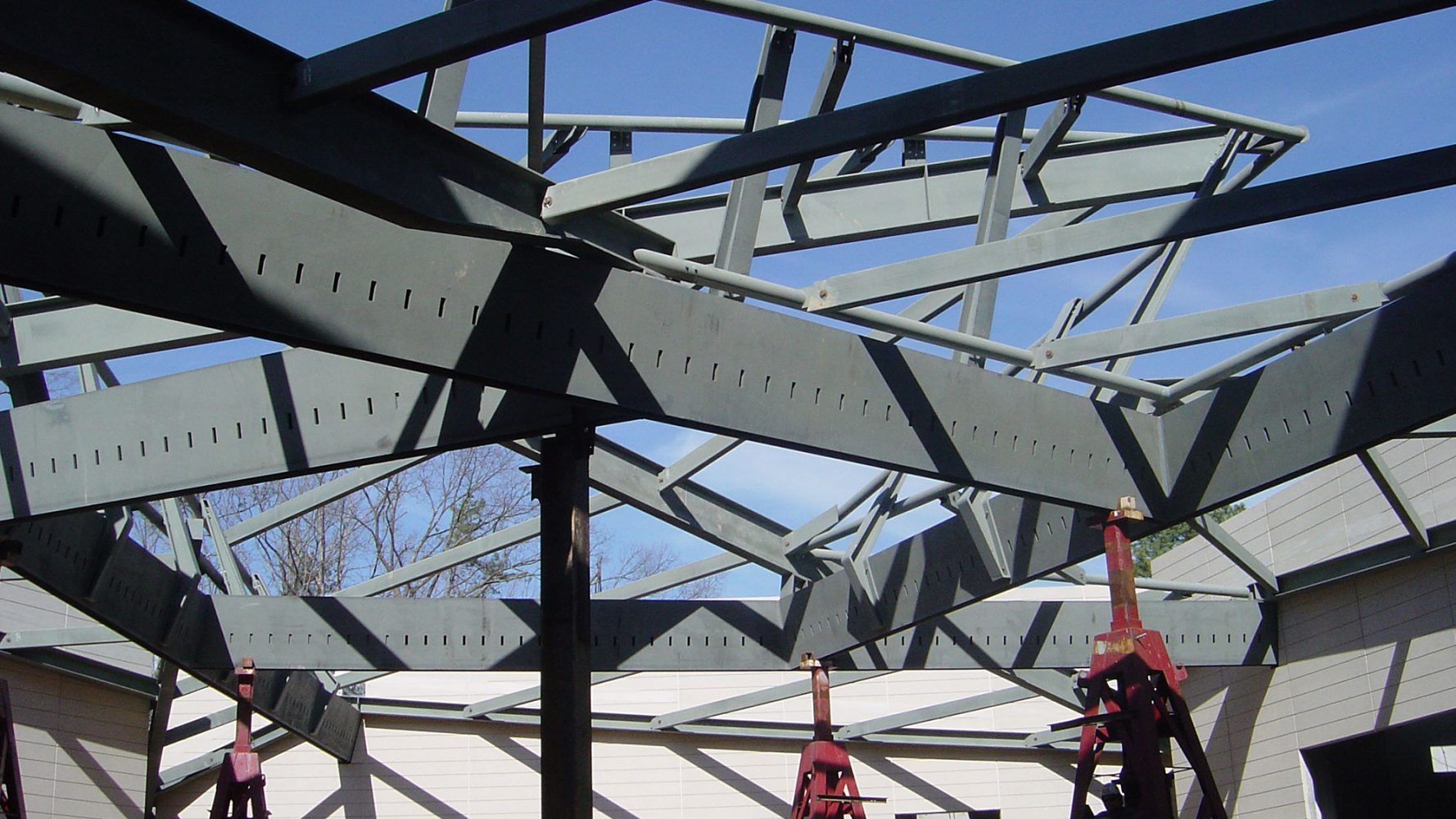
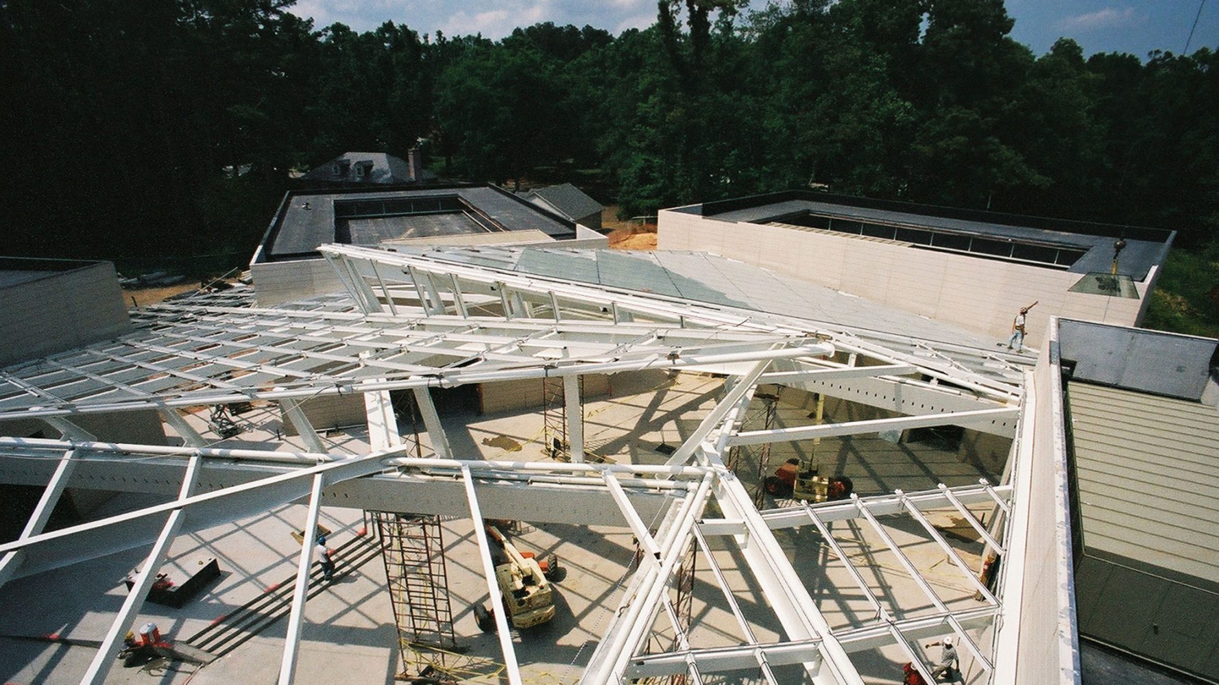
The Nasher Museum of Art is conceived as a series of pavilions in a park that draw the landscape into the museum. A collection of five separate, rectangular volumes arranged in a loose radial pattern near the top of a gentle slope define an irregular, pentagonal central courtyard topped by a glass roof. The complex, almost vertiginous geometries of the atrium roof are formed by a hierarchy of structural systems, all supported on five primary beams. This seemingly simple network of structural supports adds rhythm, lightness, scale, and openness to the column-free public lobby and event space at the heart of the museum and also incorporates the building’s mechanical systems.
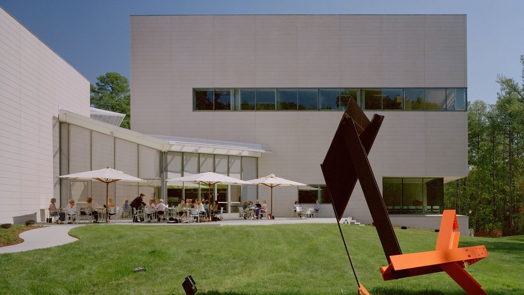
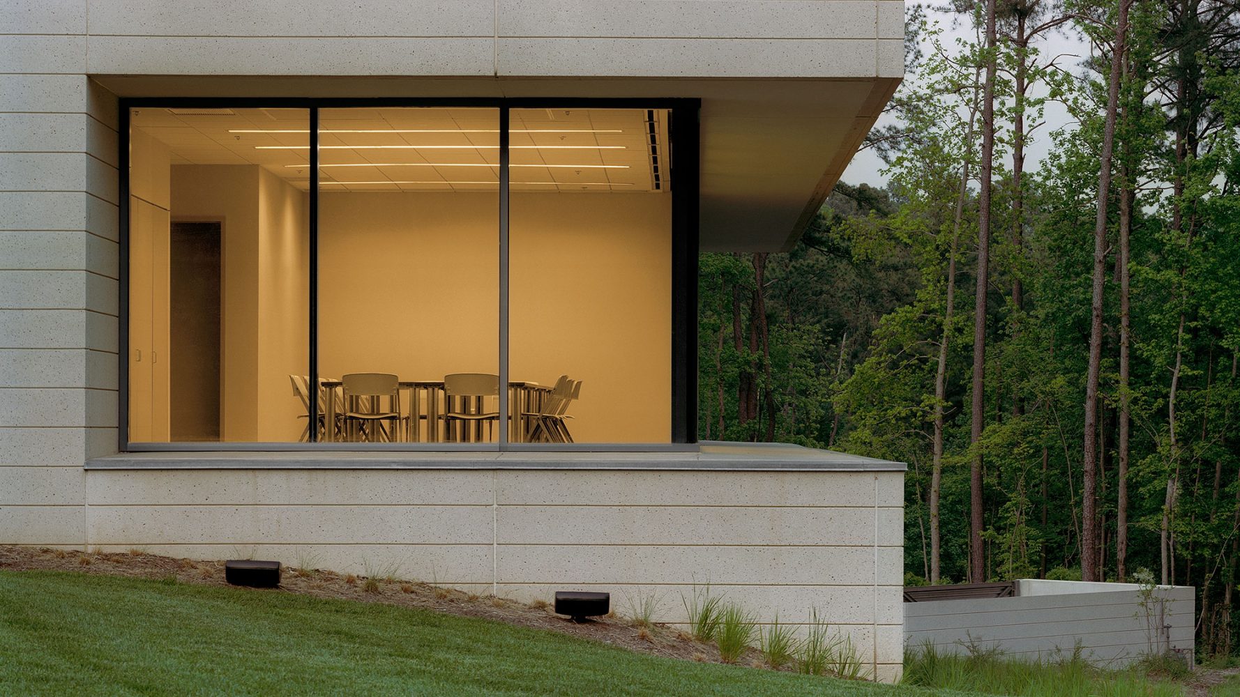
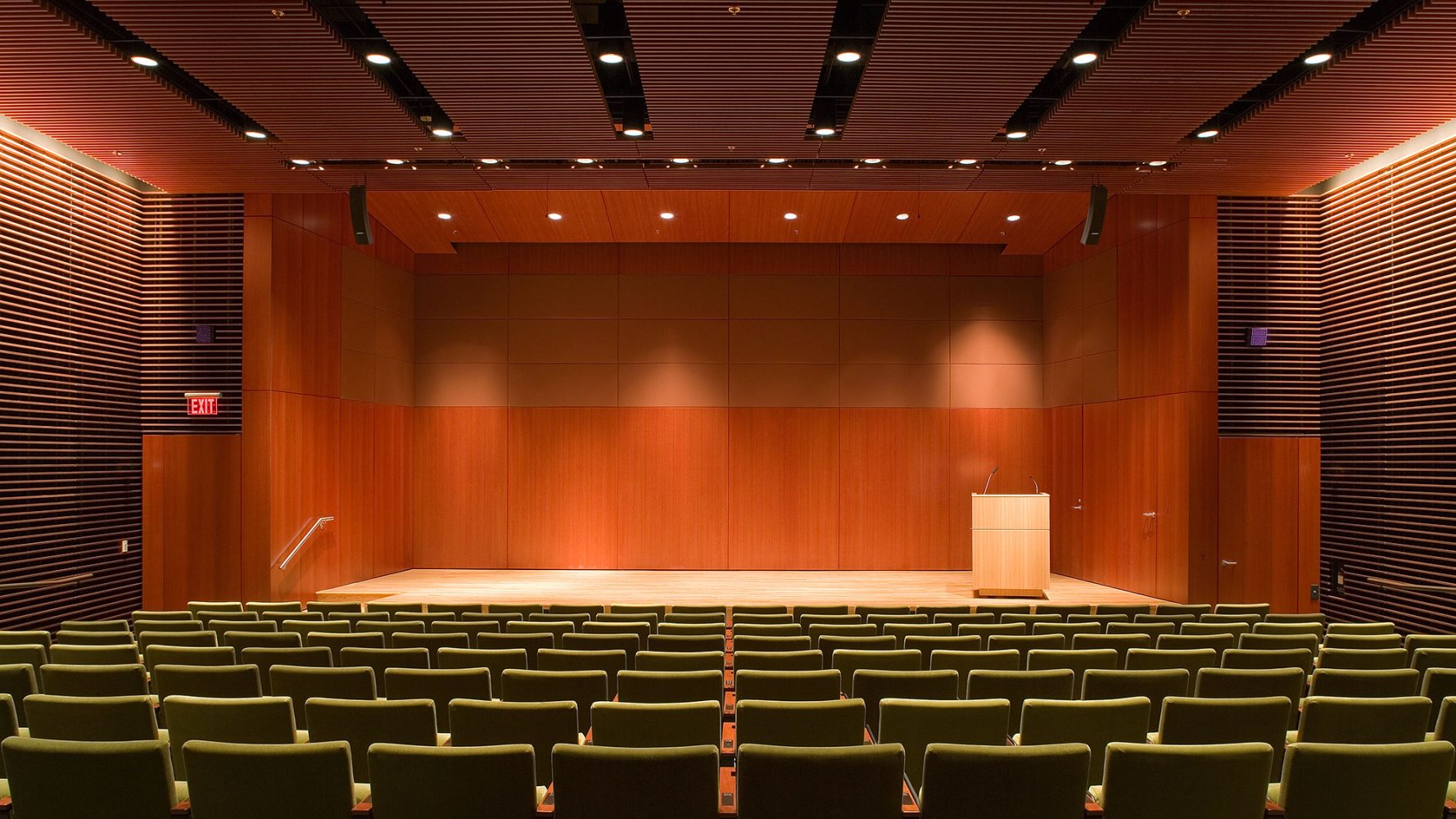
The atrium creates a strong dialogue between interior and exterior. It is flooded with sunlight and frames glimpses between pavilions to the surrounding gardens. Further blurring the inside–outside distinction, the precast concrete panels that clad the exterior of the pavilions extend into the interior atrium space, and the green slate floor extends outdoors in the form of terraces and additional café seating. Of the five pavilions, one houses the permanent collection, two are dedicated to temporary exhibitions, one houses a 173-seat auditorium, and the fifth contains classrooms, administrative offices, the café, retail space, and a partially below-grade loading dock and storage area. Visitors move easily from one pavilion to the next, always passing through the central atrium, as though through an architecturally abstracted version of the natural landscape.
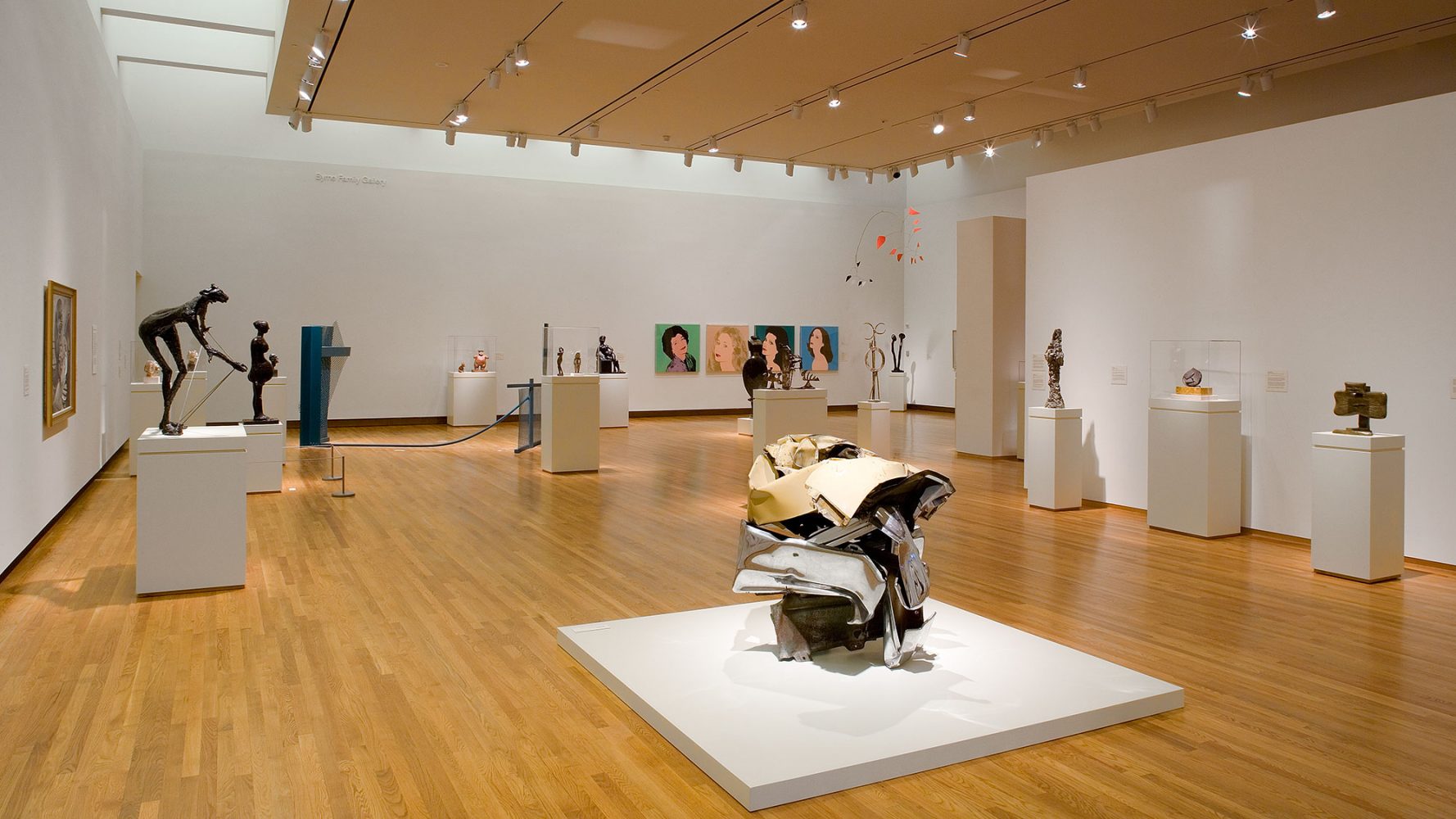
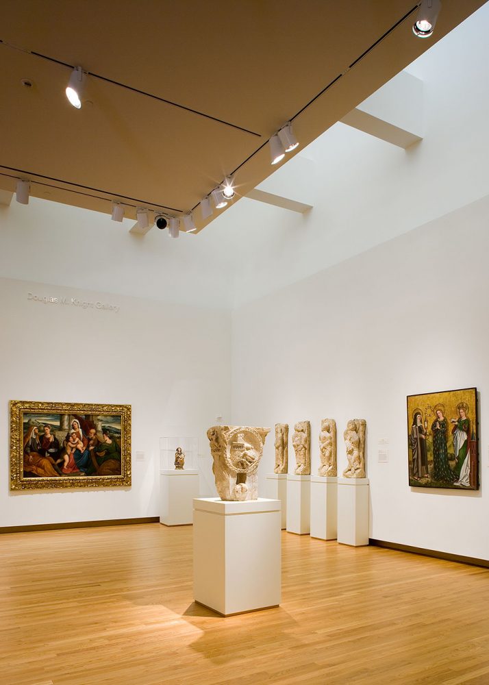
In contrast to the monolithic concrete exteriors and the dynamic atrium, the interior gallery spaces are designed to be architecturally introverted. Entered through deep vestibules from the lobby, they are white, ethereal spaces. Concealed clerestories in a ceiling cove around three sides of each gallery allow natural light to filter inside in a controlled manner that protects the artwork on display.


